Visual editor
The visual editor designs image templates on a canvas: social cards, quote images, event stories, badges. You place layers, bind their text to fields of the data and style them; the editor writes the template's HTML and CSS from the layers as you go. A render never sees the canvas, only that HTML and CSS, so an image made here renders through the same API, SDKs and integrations as any other template.
The canvas is in beta. It is available on every plan.
Start a design
In Templates, choose New template, set Kind to Image and keep A visual design on a canvas. Pick a starter:
| Starter | Size | What it has |
|---|---|---|
| Blank | a size preset of your choice | an empty white canvas |
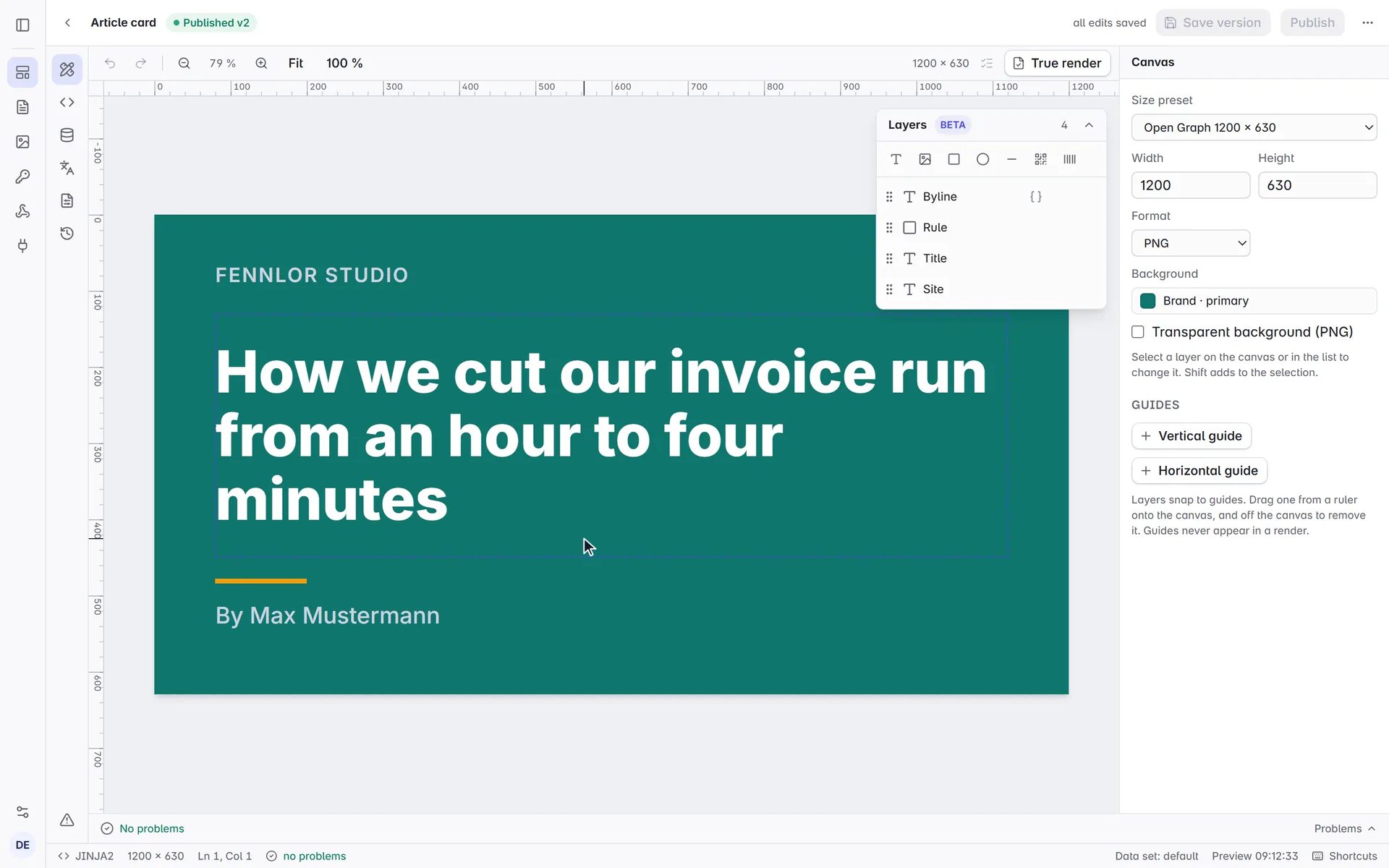
| Article card | 1200 × 630 | site name, a title that shrinks to fit, a rule and a byline |
| Quote card | 1080 × 1080 | a quotation mark, the quote, its author and role |
| Event story | 1080 × 1920 | label, title, date, place and a QR code to the event page |
The starters come with sample data, so the canvas shows real text from the start. Code: HTML and CSS creates an image template you write by hand, as before.
An image template that is code has a Design panel too. It offers the same starters; choosing one replaces the template's body and CSS with the design's. Nothing changes until you save a version, and Discard changes brings the code back.
The canvas
A design template opens on the Design panel: the canvas in the middle, the Layers in a card over its top right corner, the inspector for the selection on the right. The arrow in the card's header folds it away when a zoomed canvas needs the room. As in an image editor, rulers on the top and left edges of the view measure the image in pixels wherever it scrolls; they mark the extent of the selection and follow the pointer. Below 1100 px the layers move into the Design panel beside the canvas, with the inspector under them.
| To | Do |
|---|---|
| Select a layer | click it on the canvas or in the list; Shift adds to the selection |
| Select several | drag a frame around them on an empty part of the canvas |
| Select all, select none | Ctrl+A, Escape |
| Move | drag the layer, or the round handle with the arrows under it; the arrow keys move 1 px, with Shift 10 px |
| Resize | drag a handle; Shift keeps the proportions, Alt resizes from the centre, Ctrl (⌘ on a Mac) without snapping |
| Rotate | drag the round handle above the layer; Shift snaps to 15° |
| Type into a text | select it and start typing, click it again, double-click it or press Enter; Enter keeps the text, Escape cancels |
| Bold, italic, underline | Ctrl+B, Ctrl+I, Ctrl+U switch it for the whole of each selected text, also while you type into one |
| Duplicate, delete | Ctrl+D, Delete or Backspace |
| Change the order | ] and [ move a layer up and down, with Ctrl to the top or bottom |
| Undo, redo | Ctrl+Z, Ctrl+Shift+Z or Ctrl+Y |
| Zoom | Ctrl and the mouse wheel (around the pointer), the zoom buttons, Fit and 100 % |
| Pan | hold Space and drag, or scroll |
On a Mac, ⌘ works wherever the table says Ctrl.
While you move or resize a layer, its edges and centre snap to the edges and the centre of the canvas, to the edges and centres of the other layers and to your guides; pink lines show where. Hold Alt while moving, or Ctrl (⌘) while resizing, to place it freely. A rotated layer resizes without snapping.
Guides
Drag from the top ruler for a horizontal guide, from the left one for a vertical one; a guide crosses the whole view. Drag a guide to move it, and off the canvas to remove it; a guide being dragged snaps to the canvas and the layers, and shows its position. With nothing selected, the inspector lists the guides with their positions, for exact values, and adds new ones in the middle of the canvas. Guides belong to the design and never appear in a render.
Dropping an image file onto the canvas, or pasting a picture with Ctrl+V (a screenshot, a copied image, files from the file manager), uploads it to the workspace file library and shows it as an image layer. A pasted screenshot or copied picture gets a name of its own (pasted-<date>-<time>.png), so it never replaces another file. A file you drop or paste from the file manager keeps its own name, and the library replaces a file of the same name.
Layers
The add bar above the list adds a text, an image, a rectangle, an ellipse, a line, a QR code or a barcode. The list shows the top layer first; drag a row to change the order. The eye hides a layer (a hidden layer is not in the template at all), the lock keeps it from being selected or moved on the canvas. Double-click a name or press F2 to rename it.
Text
A text from the add bar opens for typing on the canvas at once, with its placeholder selected, so what you type replaces it. A text that is selected takes what you type as well, after what is there; a click on it places the cursor where you clicked.
The text field in the inspector holds text and fields of the data. Type { or use the braces button to insert a field; it shows as a chip and renders as the field's value. Click a chip to format it: upper or lower case, title case, money, a number with or without decimals, a date in one of three patterns, shortened to 40 characters, or a dash when the value is empty. The four entries at the end of the menu take a value of your own: a date pattern (for example EEEE, d MMMM), the number of decimals, the length to shorten to, or the text to show when the field is empty.
Font, weight (by name, from Thin to Black), size, line height, letter spacing, colour and alignment apply to the whole layer, and so do bold, italics, underline, strikethrough and capitals: a layer is one style throughout, so a word in another font or colour is a layer of its own. Bold switches between regular and bold; the weight list beside it sets anything in between. The font comes from your brand kit (its heading and body font), from your organisation's own fonts, or from a list of Google Fonts that renders the same in the preview and in the render. Upload your own fonts under the list adds font files (woff2, woff, ttf, otf) to your organisation without leaving the editor; they are the fonts of the Fonts page, which paid plans include.
While a text is typed into on the canvas, the round handle with the arrows stays under its box, so the layer can be moved without leaving the text.
Long text decides what happens when the data is longer than the box:
- Cut off keeps the size and clips what does not fit, and the Problems list says which layer does not fit with which data set.
- Shrink to fit makes the text as large as fits, between its size and Smallest size. This is what a title of varying length needs. It works in code templates too: see fit text to its box.
- Grow the box lets the box grow downwards with its text.
At most lines cuts the text off after that many lines with an ellipsis.
The canvas measures the data set on screen. Check every data set (the list button above the canvas, or the command palette) renders each of the template's data sets in the background and lists in Problems every layer whose text does not fit its box with one of them, which is the question every image with a variable title has. It needs at least two data sets; add them in the Data panel. The result stands until the design, the data or the settings change.
Images, shapes and codes
An image layer from the add bar starts empty and says so on the canvas: choose a picture under File in the inspector, use Upload an image there, drop or paste a picture onto the layer, or choose another source. Until then it renders as an empty box, and the Problems list names it. An image comes from the file library, a web address, a field of the data (a URL in the data, a different picture per render) or the brand logo. File opens the pictures of the workspace's file library, newest first, with a search by name; Upload an image in the list adds a file and shows it on the layer at once. The library's PDFs are not in the list: an image layer takes pictures only. Fill and crop covers the box, Show all fits the whole picture inside it, Stretch distorts it to the box.
Rectangles, ellipses and lines take a fill; rectangles and images also take a corner radius. A QR code or barcode encodes fixed text or a field of the data (Encodes); it is drawn with the same helpers as in code templates. A QR code has an Error correction level (L 7 %, M 15 %, Q 25 %, H 30 %, the share of the code that may be damaged and still read), a code colour and a background. A barcode has a Type (Code 128, EAN-13, EAN-8, UPC-A, ITF-14 or Code 39) and Show the digits for the text under the bars.
What every layer has
The inspector shows Width, Height, Rotation (°) and Opacity (%) for every layer, and the buttons to bring it to the front or send it back, duplicate it and delete it. With several layers selected, Align lines up their edges or centres, and Equal gaps across and Equal gaps down spread them evenly.
Shadow, colours and conditions
Shadow puts a shadow behind the letters of a text, and behind the box of every other layer: how far to the right and down, how blurred, in which colour and how opaque.
Colour fields offer your brand colours first. A brand colour stays linked to the brand kit: change the colour there, and every design that uses it follows. Under them is the colour picker for every other colour: choose in the colour area, set the hue and the transparency with the two sliders, type a hex value, or take a colour from anywhere on your screen with the pipette, which Chrome and Edge offer. The ten colours you used last are kept in your browser and offered again.
Show when shows a layer only when a field of the data has a value: an author line that disappears when there is no author, a badge for sale items.
The canvas settings
With nothing selected, the inspector shows the canvas: a size preset or your own width and height, the background colour, the output format and a transparent background for PNG and WebP. The same values are on the Page setup panel.
Code and design
The design is stored with each version, beside the HTML and CSS it wrote. While they match, the design owns the code: the Template and CSS tabs are read-only, with a note that says so. Head stays editable, for an extra font link or a script.
- Detach turns the template into a code template: the next version is saved without the design, and the tabs are editable again. Older versions keep their design, so restoring one brings it back.
- If the code was changed elsewhere, for example with
formfeed templates pushafter editingtemplate.htmlby hand, the design no longer matches it. The canvas then shows the code as it is, read-only, and offers Compare (what the design would write beside the current code), Apply the design again (the design writes the code again, replacing the edits) and Keep the code (the template becomes a code template).
A design is authoring data only: renders ignore it, and so they ignore a design in a render request's settings.
Through the API and the CLI
The design is settings.design of a version (settings reference): a JSON object with the layers from bottom to top, the canvas background, the guides and a hash of the code it last wrote. Treat it as the editor's data, not as a format to write by hand. Pass it back unchanged when you create a version through the API, or leave it out to make the version a code template.
The API refuses a design larger than 256 kB with 400 invalid_request. The editor opens a design of at most 200 layers and 5,000 characters of text per layer; a design it cannot read stays a code template, and the canvas says The design cannot be opened and offers to remove it, which changes nothing in the code.
formfeed templates pull writes it to design.json in the template folder (project layout), and push sends it back with the version. formfeed validate warns when template.html or style.css no longer match design.json.
Preview and render
The canvas shows the template rendered in your browser with the data set on screen. True render renders it through the same pipeline as the API. For text that shrinks to fit, Chrome and Edge choose the same size as the render and Firefox practically the same; Safari's canvas can show such a title up to about 5 % smaller. True render always shows the exact result.
Code templates: edit text in the preview
Templates written as code, PDF templates included, have no canvas, but their wording can still be changed without reading the code: switch on Edit text above the flow or paged preview and click a text. The change goes into the template source as one edit that Ctrl+Z undoes; values from the data stay as they are, and a { you type that could start template syntax is written as {, so typed text never becomes code. It works only in the flow and paged previews of the editor, never in a true render, a saved version or an API render. The editor tour describes it in full.